Bespoke AI strategy and the technology you need.
In one place.
Our brand transformation
Following an extensive strategic marketing review, we embarked on a journey to realign Ragu with its evolving essence. By identifying the magician archetype, understanding our ideal customer profile, and analyzing our competitive landscape, we recognized an opportunity to better express the Ragu brand.
This Brand Book represents the culmination of that transformative work—a sophisticated evolution that embraces refined gravitas, softened intellect and cool precision. Ragu’s new luminous palette of sophisticated indigo and ethereal accents reflects the commitment to thoughtful design, trustworthy technology and an elevated user experience. It also firmly positions you in the increasingly purple-hued AI space. This is Ragu reimagined: magical yet grounded, premium yet approachable, modern yet timeless.
Role: Graphic Design within Marketing Team
Color Palette
Each color in our palette serves a distinct purpose, creating cohesive, elegant experiences across all touchpoints. These colors create a visual language that's both systematic and flexible, ensuring every Ragu touchpoint feels unmistakably ours.
Ragu Indigo (#2C264A) anchors the brand as the hero color—use it for primary elements, key messaging and focal points that demand attention. This deep, sophisticated tone establishes our credibility and premium positioning.
Lavender Blue (#D9E2FE) provides gentle support, perfect for secondary information, subtle backgrounds and complementary elements that need to feel approachable yet refined.
Light Gray (#F0F2FA) brightens and clarifies, ideal for UI elements, highlights and creating breathing room that keeps our designs clean and user-friendly.
Dark Gray (#3D3D3D) and Black (#222222) handle the functional work—body text, rules, accents and borders that provide structure without competing with our primary palette.
Sterling (#CACCD5) adds that special metallic touch, representing the luminous quality that makes our brand feel modern and slightly magical.

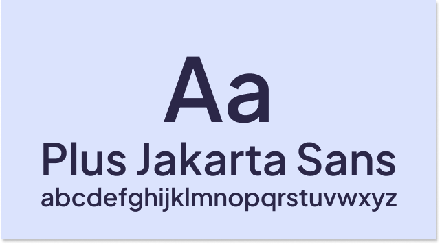
Typography
Ragu uses Plus Jakarta Sans across all brand applications for its clean, modern aesthetic that supports refined positioning.
Hierarchy and usage:
Headlines: SemiBold weight, appropriately sized—never oversized or dramatically bold
Subtitles: Regular weight, providing clear hierarchy without competing with headlines
Body text: Regular weight for optimal readability (usually 11 point and rarely smaller)
Logo lockup: Medium weight maintains brand presence without overwhelming
Design Principles:
Maintain elegant proportions—avoid aggressive sizing
Create hierarchy through weight and spacing, not dramatic scale changes
Use consistent line spacing for clean, breathable layouts
Keep text blocks well-proportioned to maintain a sophisticated appearance
Implementation: Plus Jakarta Sans is available via Google Fonts or can be downloaded directly. Primary weights needed: Regular, Medium, and SemiBold.
Our toolkit
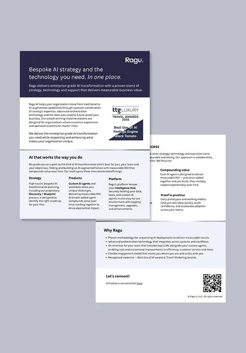
We designed tools and guidelines to bring Ragu to life consistently across every touchpoint. From email setup instructions to LinkedIn guidelines, from deck and marketing templates to visual assets, these resources were created to make our clients’ work easier while strengthening Ragu’s collective brand presence.
One Pager Templates
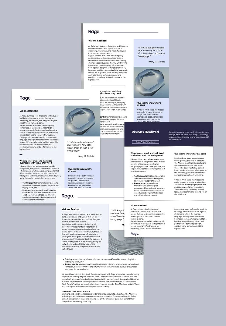
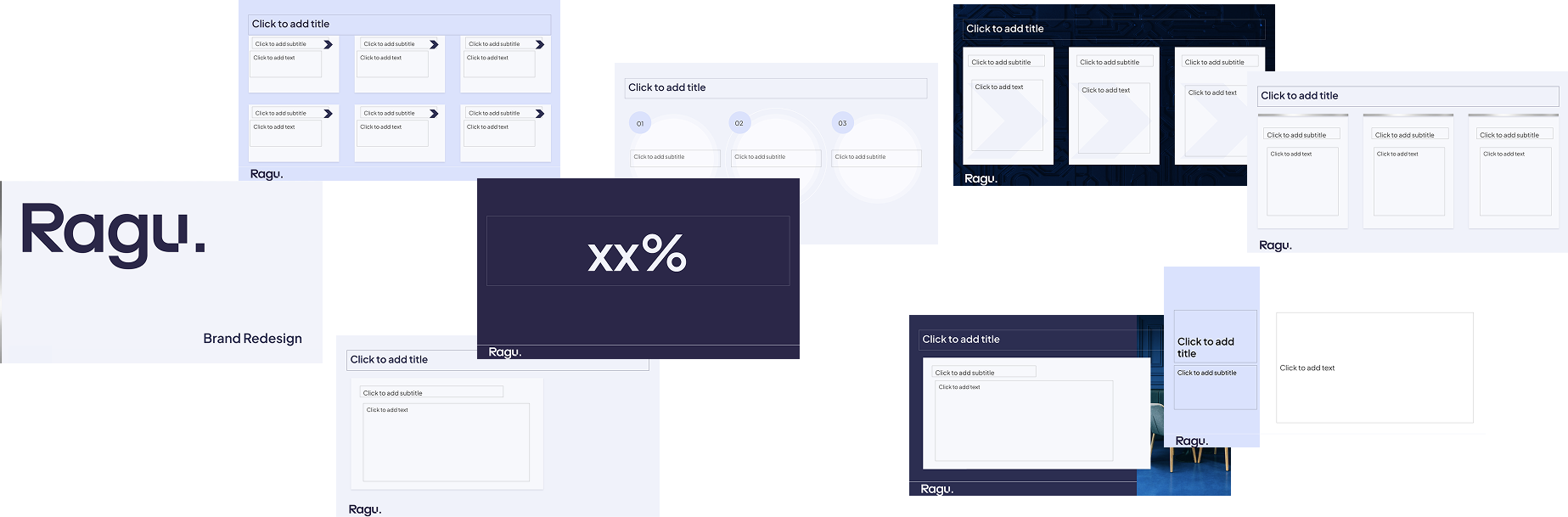
Slide Deck Template
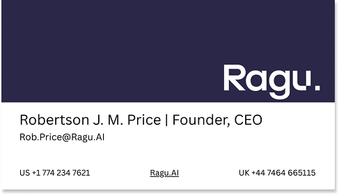
Business Card
LinkedIn Header